


Description
SPECIFICATIONS
Brand Name: XMSJ
Origin: Mainland China
About this item
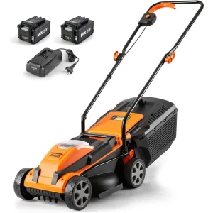
- 【13″ Cutting Width】The lawn mower has the length of 13 inch blade with 30L grass bag, perfect for small lawns.
- 【Brushless Motor】 The electric lawn mower features brushless motors that are light in voice and low in vibration. Not only can it provide powerful power, but also without the trouble of noisy and dragging in gas lawn mower, corded lawn mower.
- 【5-Position Height】The lawnmower has 5 cutting height adjustment, from 0.98″ to 2.95″,to satisfy the needs of different mowing heights.
- 【Double The Power】 Equipped with two 4.0Ah batteries,which can up to more than 60 minutes of working runtime. It can also fit with other soyus tools.
- 【Lightweight Design】Only 24 pounds, easy to push and move, and mowing work can be done easily.
- 【1 Year Warranty】Soyus provides you with a 12-month warranty. If you have any questions about this product, please feel free to contact us. .We will message back in 24 hours.
- 【Package Includes】20v 15-Inch lawn mower, 2×4.0Ah batteries, faster charger, operator’s manual.
Product information
| Power Source | Battery Powered |
|---|---|
| Style | Electric |
| Item Weight | 24 Pounds |
| Cutting Width | 15 Inches |
| Number of Positions | 5 |
| Operation Mode | Manual |
| Product Dimensions | 29″D x 17″W x 14″H |
| Item Weight | 24 pounds |
.aplus-v2 .premium-aplus-module-2 .premium-background-wrapper {
position: relative;
}
.aplus-v2 .premium-aplus-module-2 .premium-intro-wrapper {
position: absolute;
width: 50%;
height: 100%;
top: 0;
}
.aplus-v2 .premium-aplus-module-2 .premium-intro-wrapper.right {
left: 50%;
}
html[dir=”rtl”] .aplus-v2 .premium-aplus-module-2 .premium-intro-wrapper.right {
left: auto;
right: 50%;
}
.aplus-v2 .premium-aplus-module-2 .premium-intro-wrapper.secondary-color {
color: #fff;
}
.aplus-v2 .premium-aplus-module-2 .premium-intro-background {
padding: 20px;
}
.aplus-v2 .premium-aplus-module-2 .aplus-module-2-topic {
padding-bottom: 10px;
}
.aplus-v2 .premium-aplus-module-2 .aplus-module-2-heading {
padding-bottom: 20px;
}
.aplus-v2 .premium-aplus-module-2 .aplus-module-2-description {
line-height: 1.5em;
}
.aplus-v2 .premium-aplus-module-2 .premium-intro-background.white-background {
background: rgba(255,255,255,0.5);
}
.aplus-v2 .premium-aplus-module-2 .premium-intro-background.black-background {
background: rgba(0,0,0,0.5);
}
.aplus-v2 .premium-aplus-module-2 .premium-intro-background.black-background,
.aplus-v2 .premium-aplus-module-2 .premium-intro-background.black-background h1,
.aplus-v2 .premium-aplus-module-2 .premium-intro-background.black-background h5,
.aplus-v2 .premium-aplus-module-2 .premium-intro-background.black-background ol,
.aplus-v2 .premium-aplus-module-2 .premium-intro-background.black-background ul,
.aplus-v2 .premium-aplus-module-2 .premium-intro-background.black-background ol .a-list-item,
.aplus-v2 .premium-aplus-module-2 .premium-intro-background.black-background ul .a-list-item {
color: #fff;
}
.aplus-v2 .premium-aplus-module-2 .premium-intro-content-container {
display: table;
height: 100%;
}
.aplus-v2 .premium-aplus-module-2 .premium-intro-wrapper.left .premium-intro-content-container {
padding-left: 40px;
}
html[dir=”rtl”] .aplus-v2 .premium-aplus-module-2 .premium-intro-wrapper.left .premium-intro-content-container {
padding-left: 0px;
padding-right: 40px;
}
.aplus-v2 .premium-aplus-module-2 .premium-intro-wrapper.right .premium-intro-content-container {
padding-right: 40px;
}
html[dir=”rtl”] .aplus-v2 .premium-aplus-module-2 .premium-intro-wrapper.right .premium-intro-content-container {
padding-right: 0px;
padding-left: 40px;
}
.aplus-v2 .premium-aplus-module-2 .premium-intro-content-column {
display: table-cell;
vertical-align: middle;
}
/**
* Premium modules global styles
*/
.aplus-v2.desktop {
max-width: 1464px;
min-width: 800px;
margin-left: auto;
margin-right: auto;
word-wrap: break-word;
overflow-wrap: break-word;
word-break: break-word;
}
/* Undo this for tech-specs because it breaks table layout */
.aplus-v2.desktop .premium-aplus .aplus-tech-spec-table { word-break: initial; }
.aplus-v2 .premium-aplus,
.aplus-v2 .premium-aplus .aplus-h1,
.aplus-v2 .premium-aplus .aplus-h2,
.aplus-v2 .premium-aplus .aplus-p1,
.aplus-v2 .premium-aplus .aplus-p2,
.aplus-v2 .premium-aplus .aplus-p3,
.aplus-v2 .premium-aplus .aplus-accent1,
.aplus-v2 .premium-aplus .aplus-accent2
{ font-family: Arial, sans-serif; }
.aplus-v2 .premium-aplus,
.aplus-v2 .premium-aplus .aplus-h1,
.aplus-v2 .premium-aplus .aplus-h2,
.aplus-v2 .premium-aplus .aplus-p1,
.aplus-v2 .premium-aplus .aplus-p2,
.aplus-v2 .premium-aplus .aplus-p3,
.aplus-v2 .premium-aplus .aplus-accent1,
.aplus-v2 .premium-aplus .aplus-accent2
{ font-family: inherit; }
/* type */
.aplus-v2 .premium-aplus .aplus-h1 { font-size: 32px; line-height: 1.2em; font-weight: 500; }
.aplus-v2 .premium-aplus .aplus-h2 { font-size: 26px; line-height: 1.25em; font-weight: 500; }
.aplus-v2 .premium-aplus .aplus-h3 { font-size: 18px; line-height: 1.25em; font-weight: 500; }
.aplus-v2 .premium-aplus .aplus-p1 { font-size: 20px; line-height: 1.3em; font-weight: 300; }
.aplus-v2 .premium-aplus .aplus-p2 { font-size: 16px; line-height: 1.4em; font-weight: 300; }
.aplus-v2 .premium-aplus .aplus-p3 { font-size: 14px; line-height: 1.4em; font-weight: 300; }
.aplus-v2 .premium-aplus .aplus-accent1 { font-size: 16px; line-height: 1.4em; font-weight: 600; }
.aplus-v2 .premium-aplus .aplus-accent2 { font-size: 14px; line-height: 1.4em; font-weight: 600; }
/* spacing */
.aplus-v2 .aplus-container-1 { padding: 40px; }
.aplus-v2 .aplus-container-1-2 { padding: 40px 80px; }
.aplus-v2 .aplus-container-2 { padding: 80px; }
.aplus-v2 .aplus-container-3 { padding: 40px 0; }
/* Display */
.aplus-v2 .premium-aplus .aplus-display-table { display: table; }
.aplus-v2 .premium-aplus .aplus-display-table-cell { display: table-cell; }
.aplus-v2 .premium-aplus .aplus-display-inline-block { display: inline-block; }
/* Aplus display table with min-width 1000px and fill remaining space inside parent */
.aplus-v2.desktop .premium-aplus .aplus-display-table-width { min-width: 1000px; width: 100% }
/**
* Padding and margin for element should be 10, 20, 40, or 80 px. Considering mini 10, small 20, medium 40, large 80.
*/
/*
* Used when device = desktop
* Configured in: configuration/brazil-config/global/brand-story.cfg
*/
/* Because the carousel is implemented as an ol list,
any lists in the card text will have a secondary list style (letters).
This will give an incorrect appearance to viewers,
so we set all lists to the primary list style (numbers). */
.aplus-brand-story-card ol li {
list-style: decimal;
}
/* Top level containers */
.aplus-module .apm-brand-story-hero {
-moz-box-sizing: border-box;
-webkit-box-sizing: border-box;
box-sizing: border-box;
width: 1464px;
height: 625px;
background-color: #fff;
}
.aplus-module .apm-brand-story-card {
-moz-box-sizing: border-box;
-webkit-box-sizing: border-box;
box-sizing: border-box;
width: 362px;
height: 453px;
background-color: #fff;
}
.apm-brand-story-hero,
.apm-brand-story-card {
-moz-box-sizing: border-box;
-webkit-box-sizing: border-box;
box-sizing: border-box;
position: relative;
width: 100%;
height: 100%;
float: none;
}
.aplus-module.brand-story-card-1-four-asin .apm-brand-story-card {
/* Only 12px to account for image cell border */
padding: 12px;
}
/* Full background image (Hero 1 & Card 2) */
.aplus-module .apm-brand-story-background-image {
-moz-box-sizing: border-box;
-webkit-box-sizing: border-box;
box-sizing: border-box;
overflow: hidden;
position: absolute;
width: 100%;
height: 100%;
}
/* Card 1 small images */
.aplus-module .apm-brand-story-image-row {
-moz-box-sizing: border-box;
-webkit-box-sizing: border-box;
box-sizing: border-box;
height: 185px;
padding: 0px;
margin: auto;
display: flex;
}
.aplus-module .apm-brand-story-image-row .apm-brand-story-image-cell {
/* Use content-box to ensure image size matches editor schema */
-moz-box-sizing: content-box;
-webkit-box-sizing: content-box;
box-sizing: content-box;
padding: 0px;
margin: 0px;
width: 166px;
border: 1px solid #fff;
}
.aplus-module .apm-brand-story-image-row .apm-brand-story-image-cell .apm-brand-story-image-link {
display: block;
width: 100%;
height: 100%;
}
.aplus-module .apm-brand-story-image-row .apm-brand-story-image-cell .apm-brand-story-image-link .apm-brand-story-image-img {
display: block;
width: 100%;
height: 100%;
object-fit: cover;
}
/* Card 3 logo image */
.aplus-module .apm-brand-story-logo-image {
-moz-box-sizing: content-box;
-webkit-box-sizing: content-box;
box-sizing: content-box;
height: 145px;
margin: 0px 4px;
padding: 20px;
padding-bottom: 0px;
}
/* Text overlays */
.aplus-module .apm-brand-story-text-bottom {
-moz-box-sizing: border-box;
-webkit-box-sizing: border-box;
box-sizing: border-box;
position: absolute;
bottom: 13px;
left: 13px;
}
.aplus-module .apm-brand-story-hero .apm-brand-story-text-bottom {
background-color: rgba(0,0,0,0.6);
color: #fff;
padding: 13px 65px 13px 13px; /* accounts for overlap of first card */
width: 437px;
}
.aplus-module.brand-story-card-2-media-asset .apm-brand-story-text-bottom {
background-color: rgba(255,255,255,0.6);
color: #000;
padding: 13px;
width: 336px;
}
.aplus-module.brand-story-card-1-four-asin .apm-brand-story-text {
margin-top: 8px;
}
.aplus-module.brand-story-card-1-four-asin .apm-brand-story-text.apm-brand-story-text-single {
margin-top: 20px;
}
.aplus-module.brand-story-card-1-four-asin .apm-brand-story-text h3 {
white-space: nowrap;
overflow: hidden;
text-overflow: ellipsis;
}
.aplus-module .apm-brand-story-slogan-text {
-moz-box-sizing: content-box;
-webkit-box-sizing: content-box;
box-sizing: content-box;
margin: 0px 4px;
padding: 20px;
}
.aplus-module .apm-brand-story-faq {
-moz-box-sizing: content-box;
-webkit-box-sizing: content-box;
box-sizing: content-box;
padding-top: 10px;
}
.aplus-module .apm-brand-story-faq-block {
margin: 0px 10px;
padding: 10px;
}
.aplus-v2 .apm-brand-story-carousel-container {
position: relative;
}
.aplus-v2 .apm-brand-story-carousel-hero-container,
.aplus-v2 .apm-brand-story-carousel-hero-container > div {
position: absolute;
width: 100%;
}
/*
Ensuring the carousel takes only the space it needs.
The sizes need to be set again on the absolutely positioned elements so they can take up space.
*/
.aplus-v2 .apm-brand-story-carousel-container,
.aplus-v2 .apm-brand-story-carousel-hero-container {
height: 625px;
width: calc(100% + 15px);
max-width: 1464px;
margin-left: auto;
margin-right: auto;
}
/*
This centers the carousel vertically on top of the hero image container and after the logo area (125px).
Margin-top = (heroHeight – cardHeight – logoAreaHeight) / 2 + logoAreaHeight
*/
.aplus-v2 .apm-brand-story-carousel .a-carousel-row-inner{
margin-top: 149px;
}
/*
Cards need to have a width set, otherwise they default to 50px or so.
All cards must have the same width. The carousel will resize itself so all cards take the width of the largest card.
The left margin is for leaving a space between each card.
*/
.aplus-v2 .apm-brand-story-carousel .a-carousel-card {
width: 362px;
margin-left: 30px !important;
}
/* styling the navigation buttons so they are taller, flush with the sides, and have a clean white background */
.aplus-v2 .apm-brand-story-carousel .a-carousel-col.a-carousel-left,
.aplus-v2 .apm-brand-story-carousel .a-carousel-col.a-carousel-right {
padding: 0px;
}
.aplus-v2 .apm-brand-story-carousel .a-carousel-col.a-carousel-left .a-button-image,
.aplus-v2 .apm-brand-story-carousel .a-carousel-col.a-carousel-right .a-button-image {
border: none;
margin: 0px;
}
.aplus-v2 .apm-brand-story-carousel .a-carousel-col.a-carousel-left .a-button-image .a-button-inner,
.aplus-v2 .apm-brand-story-carousel .a-carousel-col.a-carousel-right .a-button-image .a-button-inner {
background: #fff;
padding: 20px 6px;
}
.aplus-v2 .apm-brand-story-carousel .a-carousel-col.a-carousel-left .a-button-image .a-button-inner {
border-radius: 0px 4px 4px 0px;
}
.aplus-v2 .apm-brand-story-carousel .a-carousel-col.a-carousel-right .a-button-image .a-button-inner {
border-radius: 4px 0px 0px 4px;
}

Reviews
There are no reviews yet.